Creative Director Co-Strategy Art Direction Copywriting
background
Banco Ripley was facing a competitive landscape dominated by traditional banks — distant, cold, and lacking empathy, especially toward young adults. The opportunity was clear: to connect with the “Chilennials,” a generation that values immediacy, closeness, and simplicity, but had yet to find a bank that truly spoke their language.
“Life is better when you achieve what you want”
strategy
The challenge was to redesign the brand and move away from the cold, technical language of traditional finance, positioning Banco Ripley as the young bank: simple, close, and optimistic. Based on the brand purpose “life is better when you achieve what you want,” we developed a new voice — more direct, positive, and down-to-earth — which came to life through the slogan “Enjoy it”: a clear invitation to celebrate personal achievements, without overcomplicating things.
execution
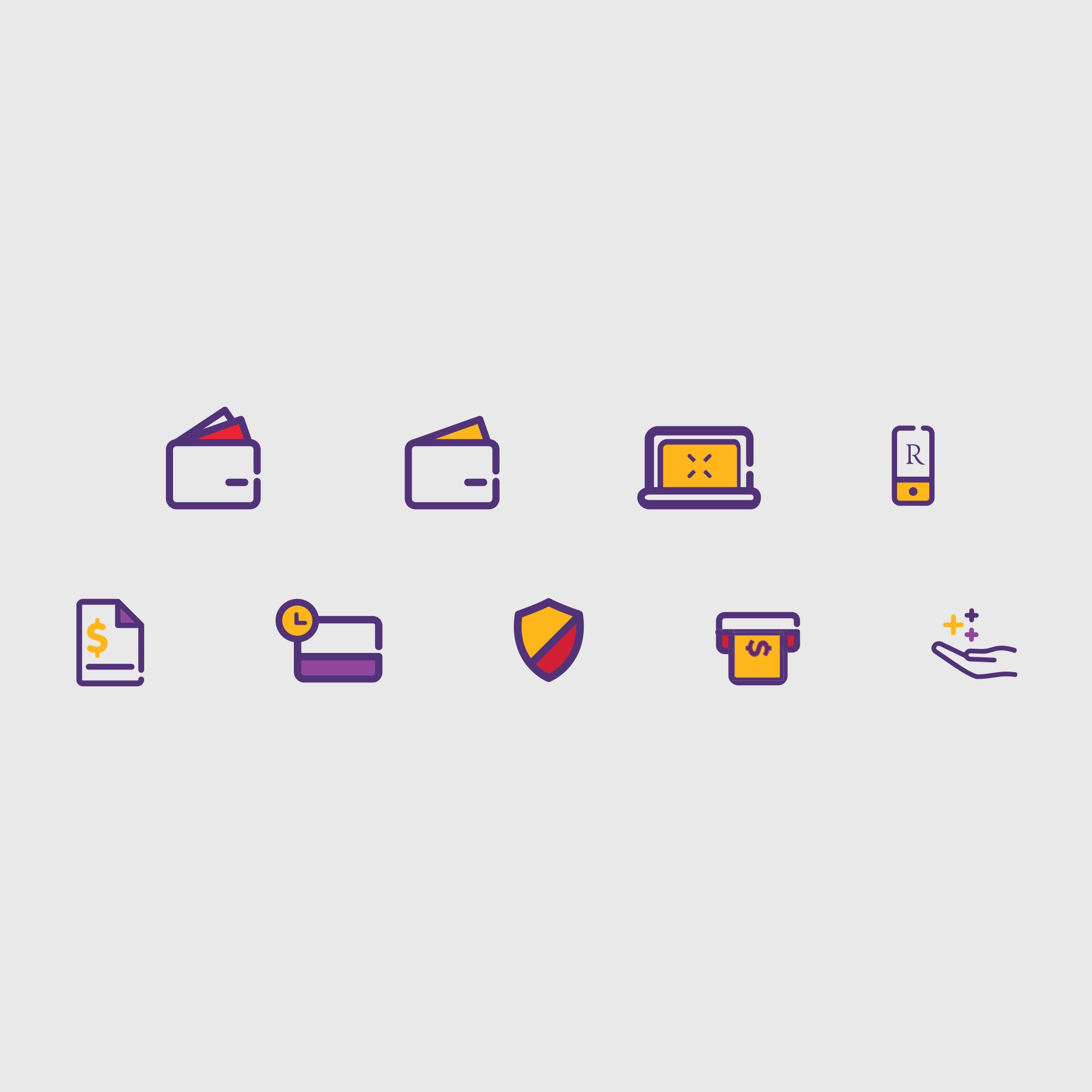
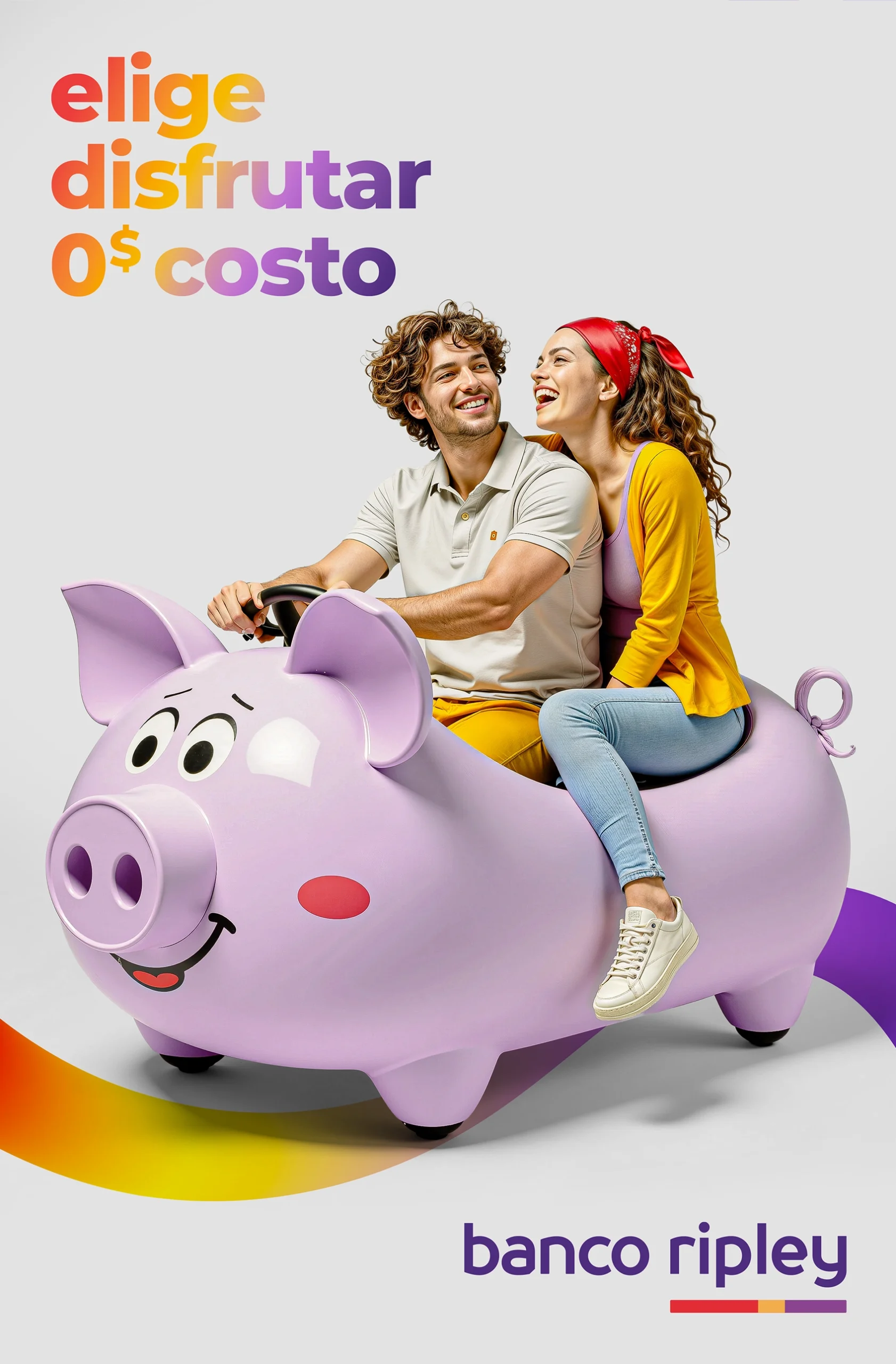
Desde lo visual, rompimos con el estereotipo bancario de fotos de stock sobreactuadas y apostamos por un lenguaje más auténtico y vibrante. Creamos un sistema gráfico fluido, con colores vitales, formas orgánicas y retratos espontáneos en estudio, que transmiten alegría real. El estilismo fue simple, pero cuidado, y cada imagen capturó momentos espontáneos. Así, la marca comenzó a hablar en el lenguaje de su audiencia: menos institucional, más parte de su día a día.